
Common Design Mistakes and How to Avoid Them


Introduction
Design plays a crucial role in creating a strong visual identity and attracting your target audience. However, even experienced designers can fall into common pitfalls that undermine their work. Understanding these mistakes and knowing how to avoid them can elevate your design projects and deliver better results.
Poor Typography Choices
Typography is more than just picking a font. It's about ensuring readability and conveying the right mood. A common mistake is using too many fonts in a single design, which can create visual chaos. To avoid this, stick to one or two complementary fonts and use hierarchy to emphasize key elements.
Another typography issue is choosing fonts that are not legible. Always prioritize readability, especially for body text. Testing your design on different devices can help ensure that all text remains clear and accessible.

Ignoring White Space
White space, or negative space, is the empty area around design elements. Some designers mistakenly fill every inch of a layout, but this can make the design feel cluttered. White space is essential for creating balance and guiding the viewer's eye through the design.
To effectively use white space, focus on margin and padding adjustments. This strategy allows elements to breathe, enhancing the overall aesthetic and improving user experience.
Inconsistent Color Schemes
Color is a powerful tool in design, but using too many colors or clashing shades can be distracting. A consistent color scheme helps in building brand recognition and setting the right tone. Stick to a limited palette and utilize color theory to ensure harmony.
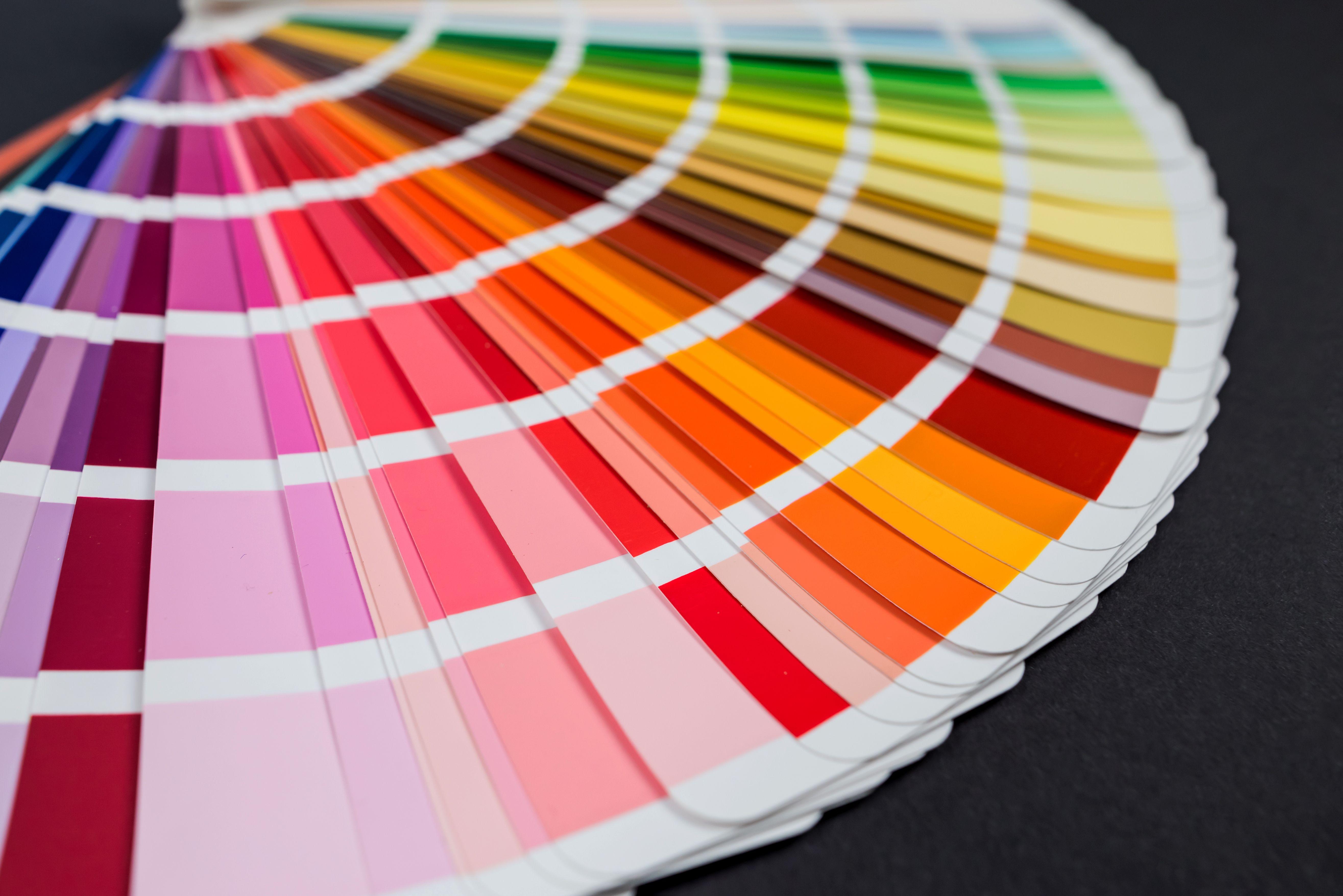
Additionally, consider the psychological effects of colors. For example, blue often conveys trust and calmness, while red can evoke excitement or urgency. Choose colors that align with the message you want to communicate.
Ignoring User Experience (UX)
One of the biggest design mistakes is neglecting the user experience. A design that looks great but is difficult to navigate will frustrate users. Prioritize intuitive navigation and ensure all interactive elements are easy to find and use.
Conducting user testing can provide valuable insights into how real users interact with your design, allowing you to make necessary adjustments to improve functionality.

Conclusion
Avoiding common design mistakes requires awareness and attention to detail. By focusing on typography, white space, color schemes, and user experience, you'll create designs that not only look good but also function effectively. Keep these tips in mind for your next project, and you'll likely see a significant improvement in your design outcomes.