Understanding the Role of Color in Interior Design


The Psychological Impact of Color
Color plays a crucial role in interior design by influencing the emotions and perceptions of the occupants. Each color can evoke different feelings and moods, making it essential for designers to understand these effects. For example, blue is often associated with calmness and tranquility, while red can invoke energy and passion. By strategically using colors, designers can create spaces that enhance well-being and comfort.
The psychological impact of color is not only about personal preferences but also cultural influences. In some cultures, white may represent purity and peace, while in others, it might be associated with mourning. Understanding these nuances is vital when designing spaces for clients from diverse backgrounds.
Color Theory Basics
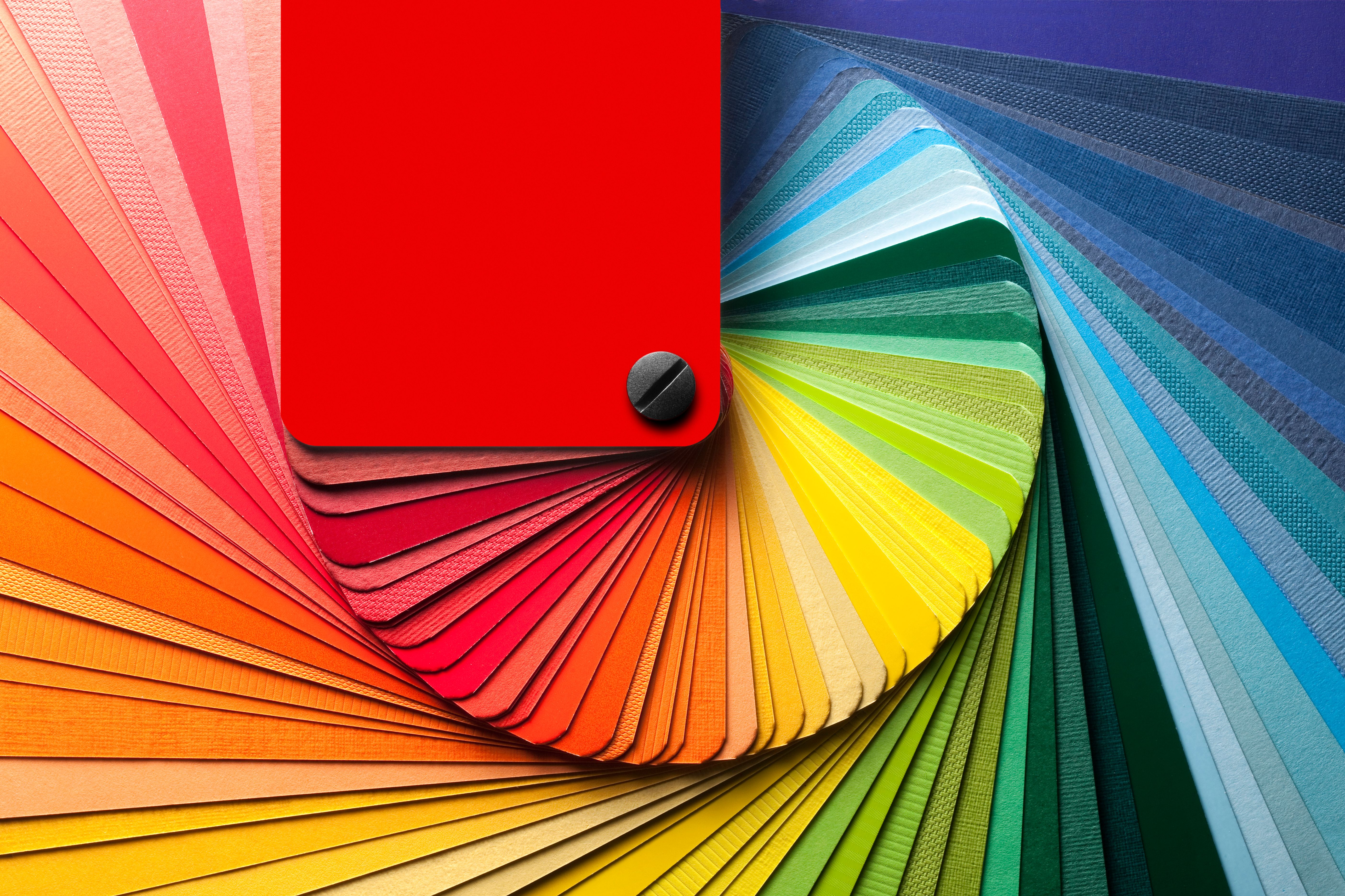
To effectively use color in interior design, it's important to grasp the basics of color theory. This involves understanding the color wheel, which consists of primary, secondary, and tertiary colors. Primary colors—red, blue, and yellow—are the foundation, while secondary colors are created by mixing two primary colors. Tertiary colors result from blending primary and secondary colors.
Color schemes, such as complementary, analogous, and monochromatic, are derived from the color wheel. A complementary scheme uses colors opposite each other on the wheel to create contrast. An analogous scheme involves colors next to each other, offering a harmonious look. Monochromatic schemes utilize different shades of a single color for a cohesive appearance.
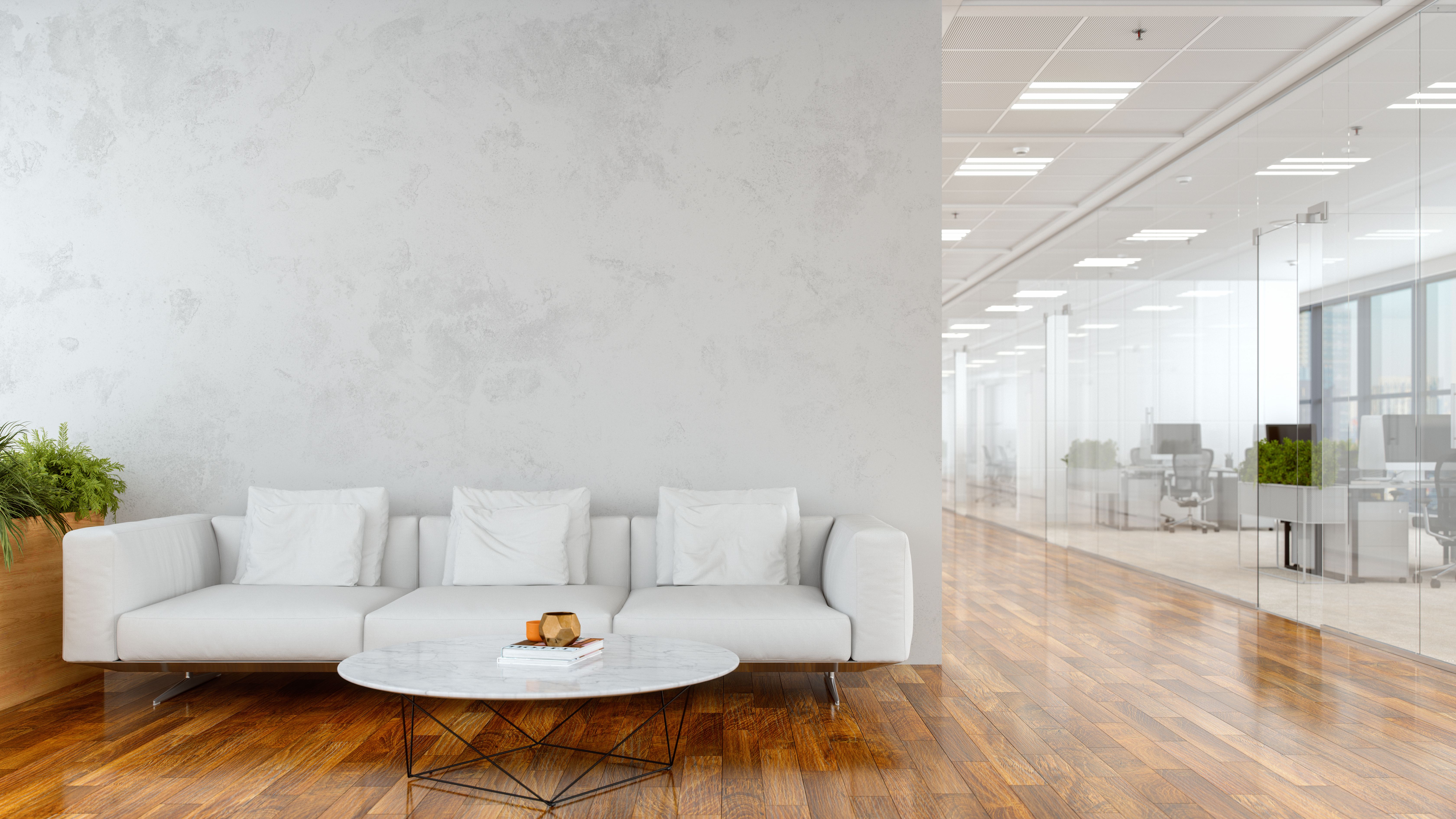
Using Color to Define Spaces
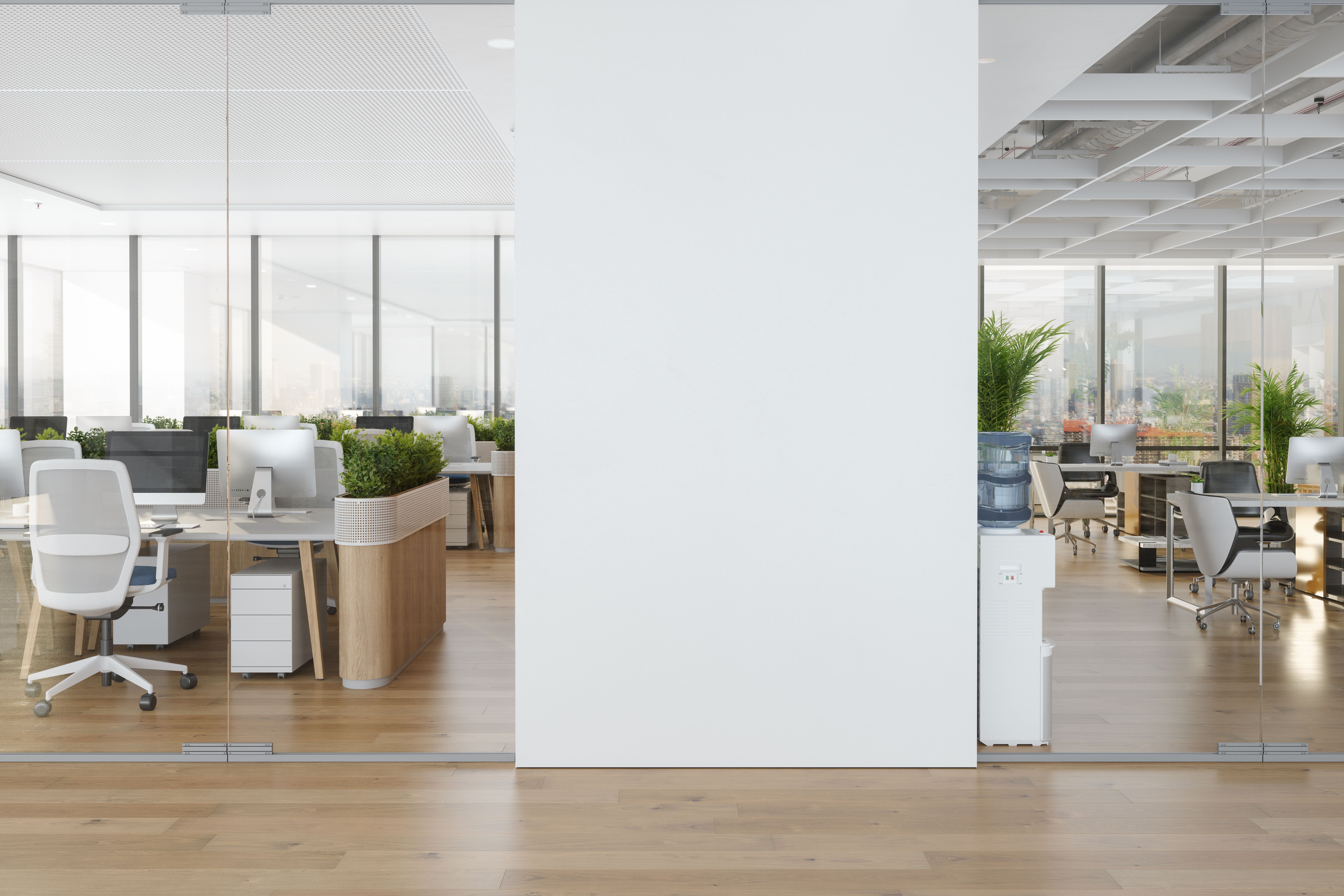
In open-plan designs, color can be used to delineate different areas without the need for physical barriers. By assigning distinct colors to various zones, designers can subtly guide movement and define spaces. For instance, a warm color palette in the living area can create a cozy atmosphere, while cooler tones in a workspace can promote concentration.
Furthermore, colors can visually alter the perception of a room's size and shape. Light colors tend to make a space feel larger and more open, whereas dark colors can create an intimate and enclosed environment. This technique is particularly useful in small apartments or homes where maximizing space is essential.
Trends in Color Usage
Trends in interior design often dictate popular color choices. Currently, there is a growing emphasis on incorporating nature-inspired hues like greens and earth tones to create a sense of calm and connection with the outdoors. These colors are often used to foster biophilic design principles, which aim to enhance human-nature interaction within built environments.
Additionally, bold and vibrant colors are making a comeback as accent pieces, adding personality and flair to otherwise neutral spaces. These pops of color can be introduced through furniture, artwork, or decorative accessories, offering flexibility and adaptability to changing trends.
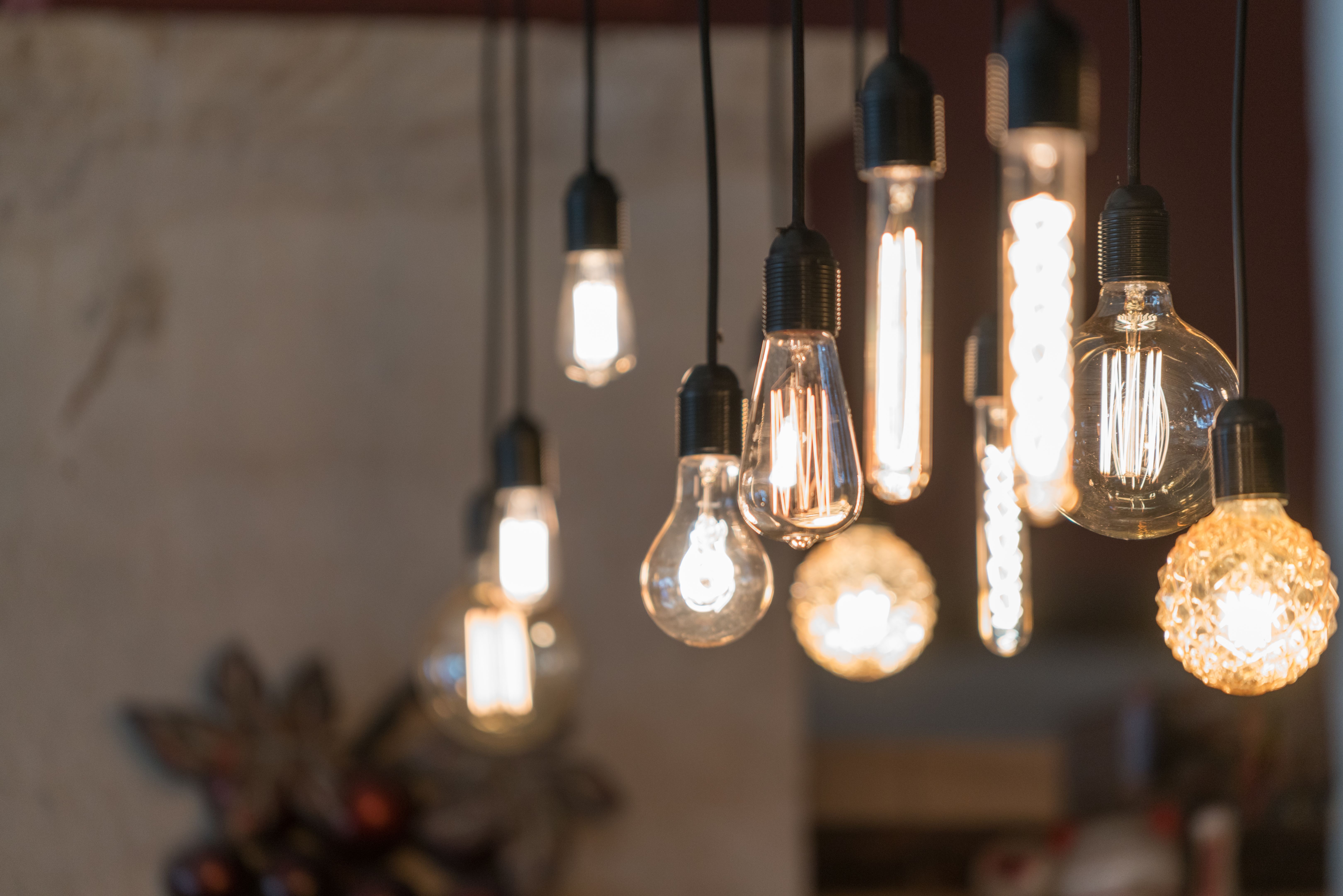
The Role of Light in Color Perception
Lighting plays a significant role in how colors are perceived within a space. Natural light can vary throughout the day, affecting the appearance of colors. Designers often consider the direction and quality of light when choosing color palettes to ensure that the chosen hues remain consistent under different lighting conditions.
Artificial lighting also impacts color perception. Warm lighting can enhance warm tones like reds and yellows, while cool lighting might emphasize blues and greens. By carefully selecting lighting types and placements, designers can highlight specific colors and create desired atmospheres.